graphic designers
graphic designers,banner designer ,cataloge designergraphic designers
graphic designers,banner designer ,cataloge designerGivingTuesday Roundup: 12 Places To Find Answers To Most Common Designer Questions

“Design is a funny word. Some people think design means how it looks. But of course, if you dig deeper, it’s really how it works.”
Steve Jobs was an intelligent man. I always remember this saying from him when I create my own designs.He was absolutely right that we should not confuse a concept of design with how things look only. It’s primarily, how things work. Until and unless your product adds value to its surroundings, it cannot be considered efficiently designed, no matter how incredible it looks. So every graphic designer has to stop at some point and think really hard how his skills and knowledge of design is helping the world become a little more coherent and attractive for the people.
Golden Ratio: Nature’s Key To Perfect Design!
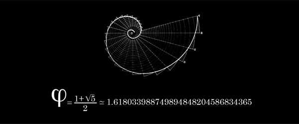
Known around the globe as the Golden Ratio, the divine proportion, Golden Mean or the Golden Section, it is a mathematical miracle in other words, the value of Phi. Based on the famous Fibonacci sequence, which goes like 1,1,2,3,5,8,13,21,34.. and so on forever, where every new number in the sequence is the combination of the two preceding it, its ratio 1.6180 has come to be known as the perfect proportion for creating well balanced and eye pleasing art and architecture. In fact every form of designing, from painting to photography to web design, the Golden Ratio has become the way to go.
Today, our country is a superpower, but it wasn’t always

The Crucial Stages of Your Brand’s Logo Design
