graphic designers
graphic designers,banner designer ,cataloge designergraphic designers
graphic designers,banner designer ,cataloge designerTips To Make Your Logo Unique

Businesses have now realized the importance of branding because they want to establish a relationship based on trust and integrity with their consumers. Hence, visual components are necessary in making up a strong brand and that’s the reason marketing experts recommend on using your brand logo everywhere! Your logo identifies your business. It has to stand out, be unique and memorable.
Designing the logo is a crucial process because you just have to get it right! You don’t want to risk your company’s sales by making common mistakes during the logo design process. For businesses, time is money. In this respect, they can take full advantage of services that can help create their customized logo design within 5 minutes.
Here are some tips to make your logo unique and striking.
Related: Innovative Logo Design In 5 Minutes!
1. Keep It Simple
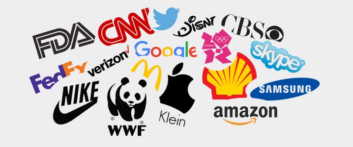
The logo’s design relies majorly on the font and shape choice. Both need to be simple. It’s why you can easily recognize brands like McDonald’s and Apple just by the logos.
McDonalds and Apple Logo
Using too many fonts or colors in your logo design will just confuse the consumer and not successfully communicate the message you wish to send. A simple look tells the consumer you are organized. A cluttered logo sends a negative first impression to the consumer. So don’t rush when it comes to selecting the perfect font or shape, take your time and experiment to choose the perfect one. Also find a font or shapes suitable to the business and refrain from using very common ones.
2. Avoid Too Many Special Effects
What is common between the Skype’s new logo and the logo for the London Olympics? Both of them seem to go overboard with special effects.
skype and london olympics logo
If your logo design needs a lot of special effects to look amazing then the design is at fault. A well-designed logo doesn’t have to rely on special effects. Design the logo without any special effects that is what makes a logo design strong. Add the effects later when you have effectively created the logo in black and white. A strong logo design looks great even without the effects.
3. Don’t Copy
Take a look at the first two logos. The first logo belongs to Pepsi and other belongs to Korean Air. Maybe one of them has copied it or maybe it is just a coincidence but with Pepsi being a stronger brand, Korean Airs’ logo doesn’t exude originality and gives a negative impression.
CNN and fda logo
The same seems to be the case for the logos of CNN and the FDA. You can see the words bleeding together into one in both cases.
If you want to have a strong brand identity copying, stealing or borrowing the basic shape or idea of another brand’s logo is a unwise move on your part.
4. Use Vector Graphics
Your logo has to go everywhere! For this purpose it is resized for different stationery and promotional items. If you plan to use clipart or photos for your logo design then don’t. Use a software like Adobe Illustrator to design the logo because vector graphics make sure the image remains consistent when resized. Clipart in logos causes problems when reproduced. By using clip art you portray your brand is cheap!
Twitter and Shell logo
5. Think Out Of the Box
Brands like FedEx and Amazon embrace this concept with their logo designs and in the process, make them unique.
FedEx and Amazon Logo
Let your creativity flow while designing the logo. Compile multiple concepts and work on the ones you find best. If you are clever with making unconventional designs work then don’t be afraid to take the risk.
Update:
6. Keep Your Color Scheme Simple
A logo that has too many colors looks unprofessional. As a designer, you might be tempted to add as much color as you can. This is a mistake. Remember, it isn’t color that defines your logo’s identity; it is how it looks. Therefore it’s best that you focus on its shape before you break out the color palette. You can play around with different shades later but make sure that you stick to a simple color combo.
The Panda and Samsung Logo
You can see how WWF keeps its logo simple by taking advantage of negative space. Samsung follows suit with a blue and white scheme for its logo.
7. Keep Fonts To A Minimum
You might be tempted to use more than two font styles to make your logo unique. This is a common mistake. Using too many fonts in a single logo is as detrimental to a design as overused fonts. It just makes your design look messy. It might also confuse viewers.
Nike and Calvin klein logo
If you want to make your logo recognizable, use no more than two fonts like Nike and Calvin Klein did –
8. Avoid Visual Cliches
Anyone who sees Nike’s Swoosh knows which brand it represents. Nike also gets props for the Swoosh symbol because no other brand had used it before. And symbols that have already been used become clichéd.
verizon and CBS classic logo
If you planned to use any similar symbols like a thought bubble or arcs don’t. These have been too over
https://www.designmantic.com/blog/tips-to-make-your-logo-unique/